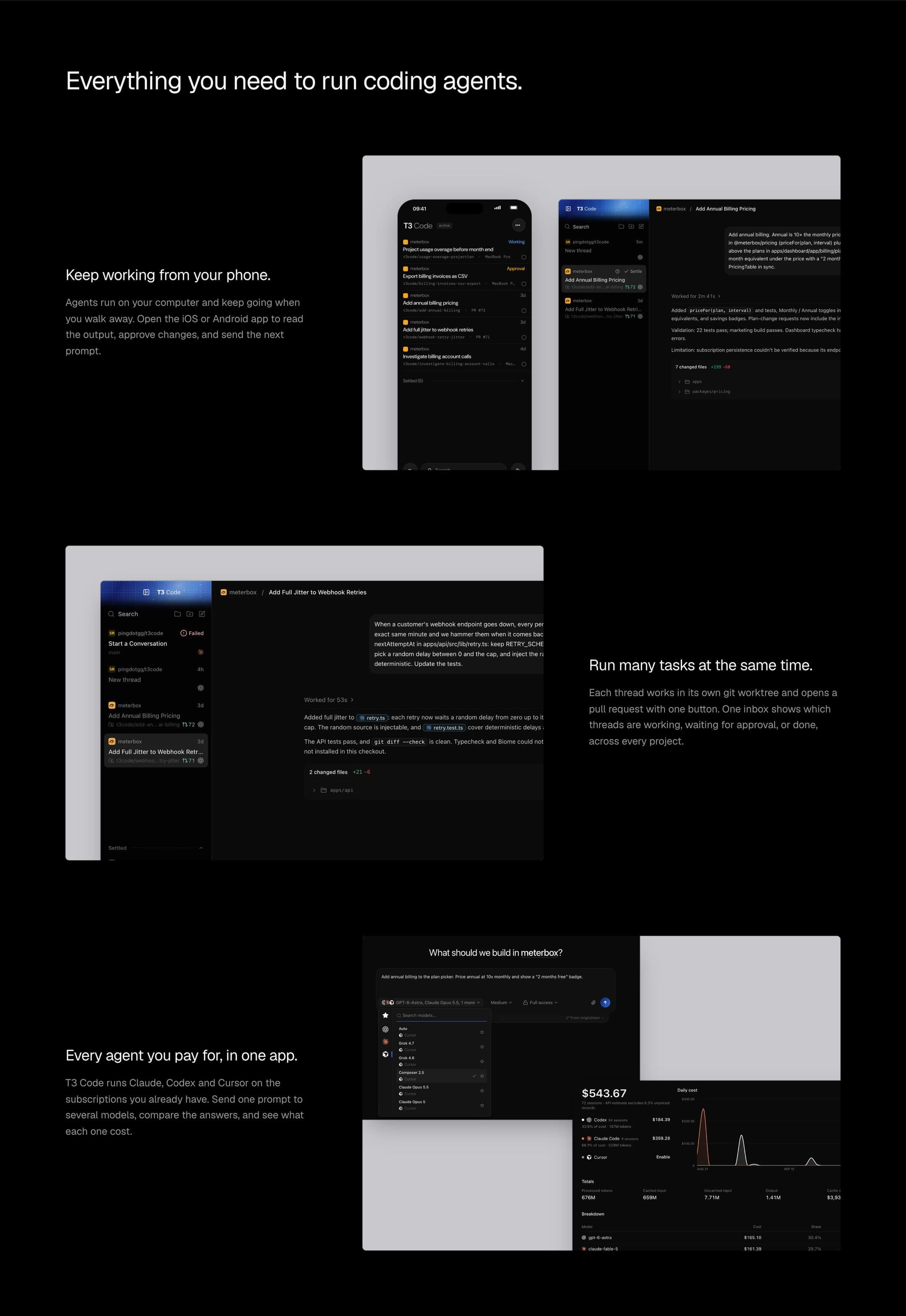
T3 Code, concept 2026
Straight to the point.
- Role
- Design and engineering
- Timeline
- 5 days, 2026
- Team
- Solo
- Live
- rahazh.com/t3
Why
T3 Code has almost half a million users, yet the website was still vibe-coded.
As someone who has watched a lot of Theo, I really respect him, and I wanted to give something back.
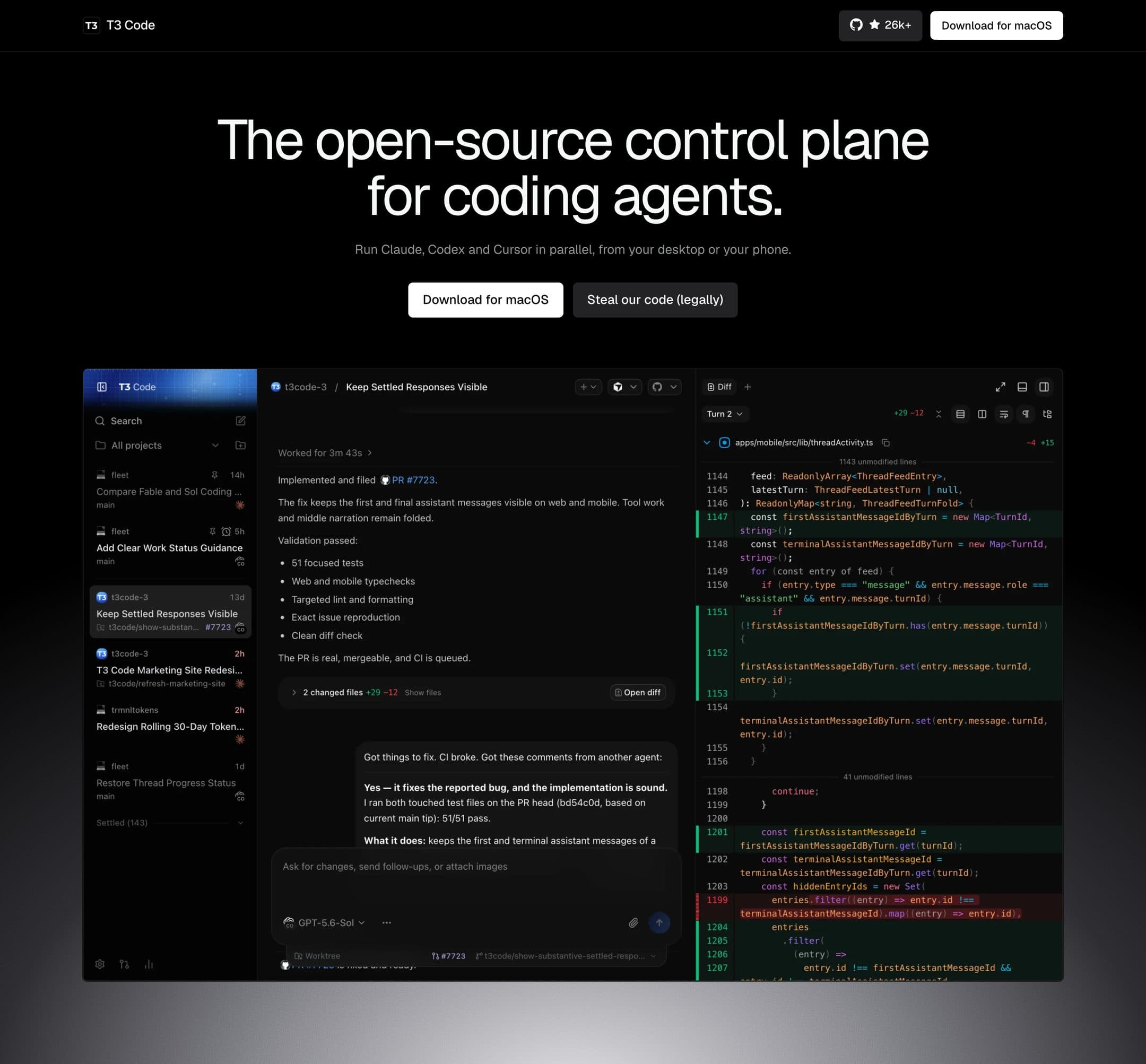
The original landing page looked like a random vibe-coded product.
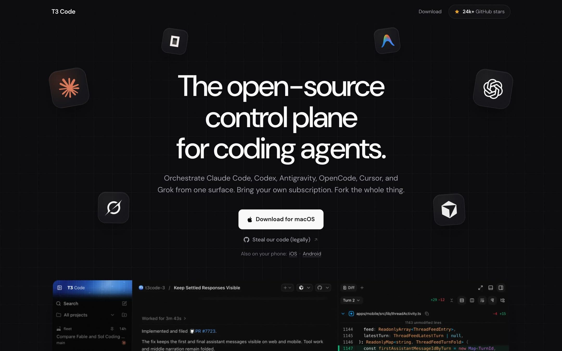
The result
Get straight to the point, like Theo always does.
The page is primarily for developers who ship fast and are really smart, like Theo himself, the archetype. It shouldn’t feel overdesigned, but it should still be on point.
When someone lands on the website, it should feel simple, yet complex. The whole idea of T3 is to get straight to the point, like Theo always does, because he’s a real engineer.
The product is made for real engineers, so there isn’t much complexity, yet there are a few visual touches that make it feel cool. I think about the product first, not about myself.
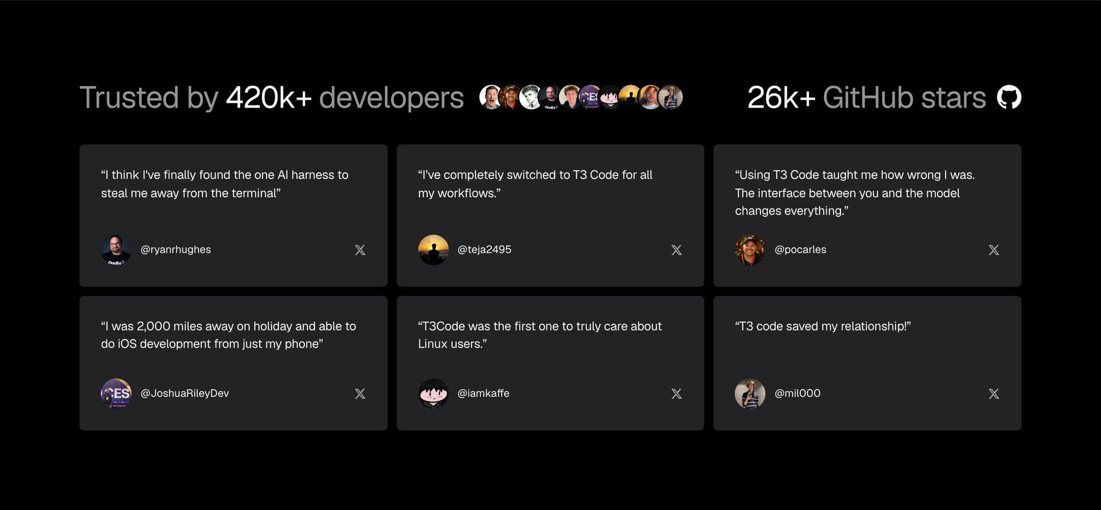
The hero section carries the whole purpose: the app itself and the description. Then it goes to the reviews, which say it has almost half a million users and 20k+ GitHub stars. Straight to the point.
The hardest decision
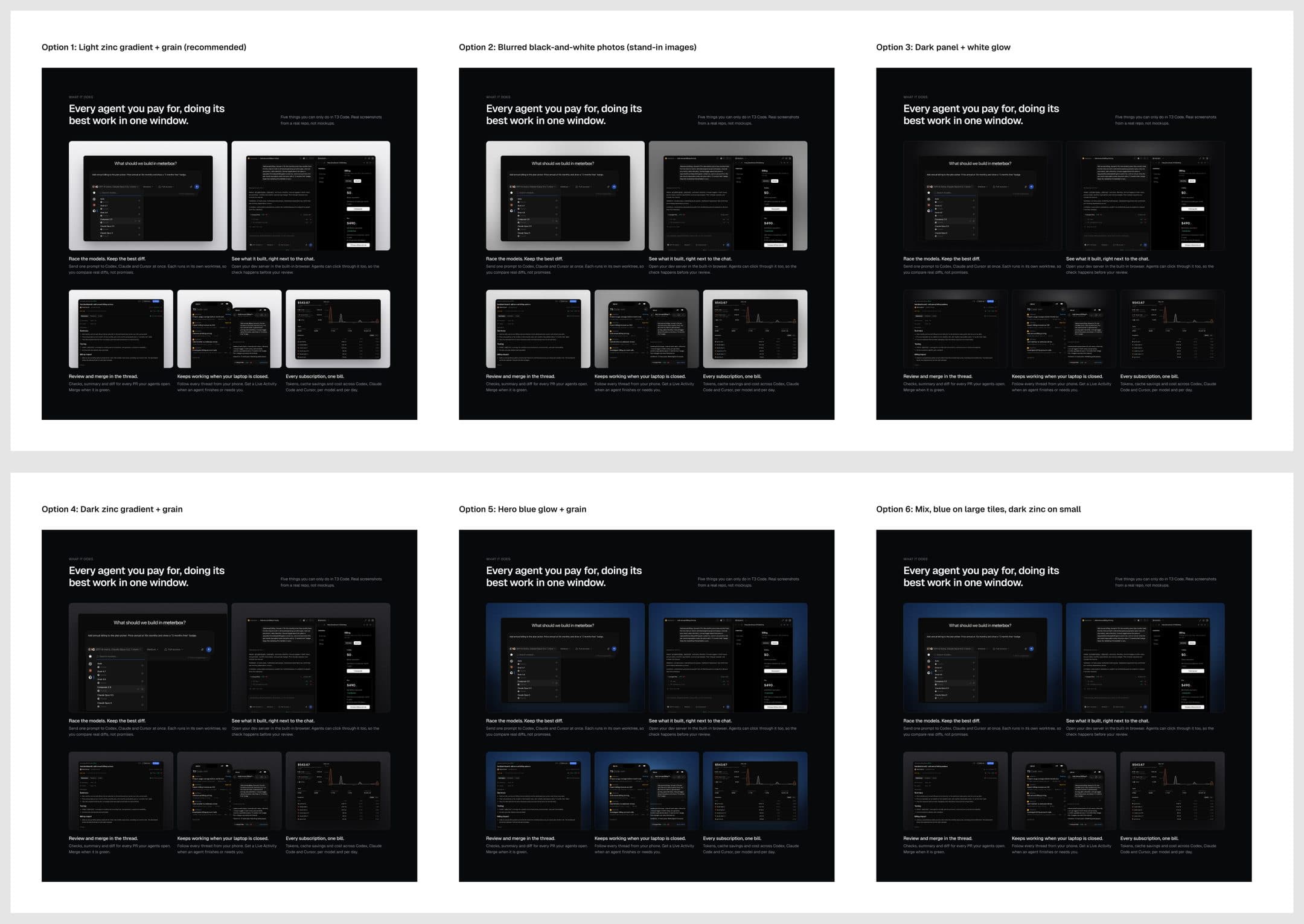
The hardest decision for me was making the website colorful.
I realized the app people are about to download is not colorful. It’s black. So I experimented a lot with adding white, brightness, and contrast.
I threw away a blue hero section with a blue glow.
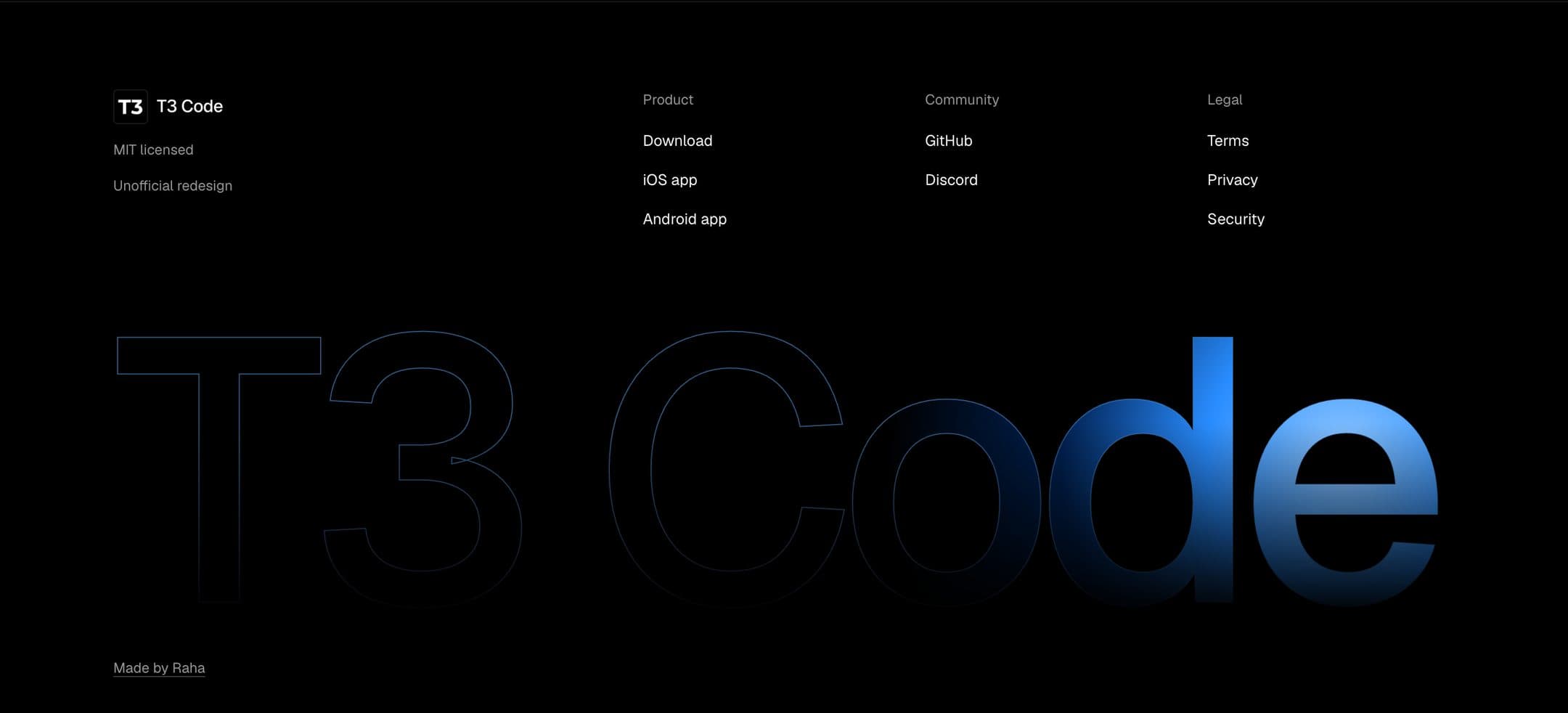
You can see it in the footer. The user sees everything in white and black, and sometimes other colors like gray and blue, and the footer really brings out that contrast.
Process
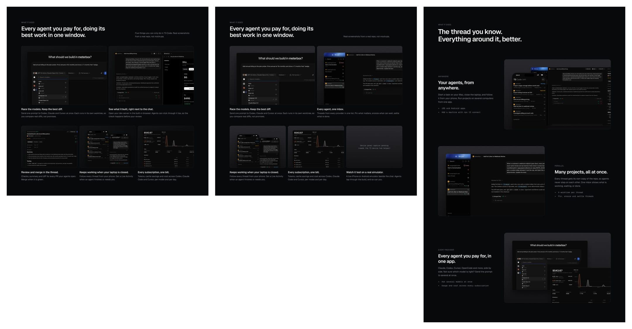
The process was not linear.
The actual work took me around 5 to 7 days, because the process was not really structured. Sometimes you need to think about the visuals, and that’s not linear. So I would say 5 days.
I studied a lot of similar apps that do the same thing. Mostly software like Cursor, Codex, Linear, and Vercel. Also a lot of the new generation, like Supabase and Granola.

Reflection
I would play around with the features more.
I haven’t really used T3 Code that much. I tried, but I’m not a fully experienced engineer yet, so I struggled with choosing the right features to show.
I would also play around with the frames that create the contrast.