rahazh.com, ongoing
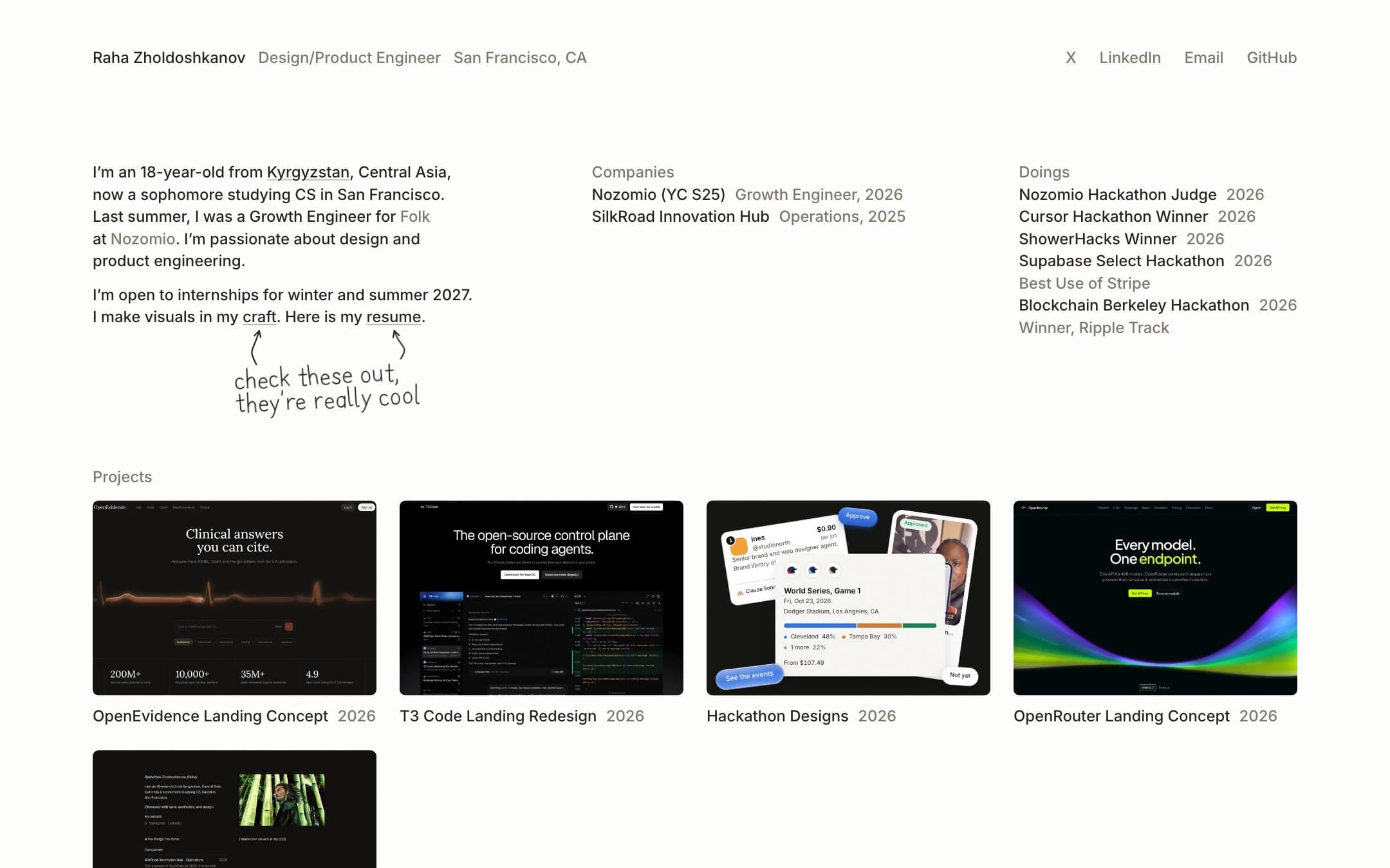
This website, in 143 commits.
- Role
- Design and engineering
- Timeline
- 19 August 2026 to now
- So far
- 143 commits on 26 days
- Made with
- Next.js and plain CSS
How it started
Six versions in nine weeks.
These are the real pages. I checked out the old commits and ran them again to take the pictures.
19 August
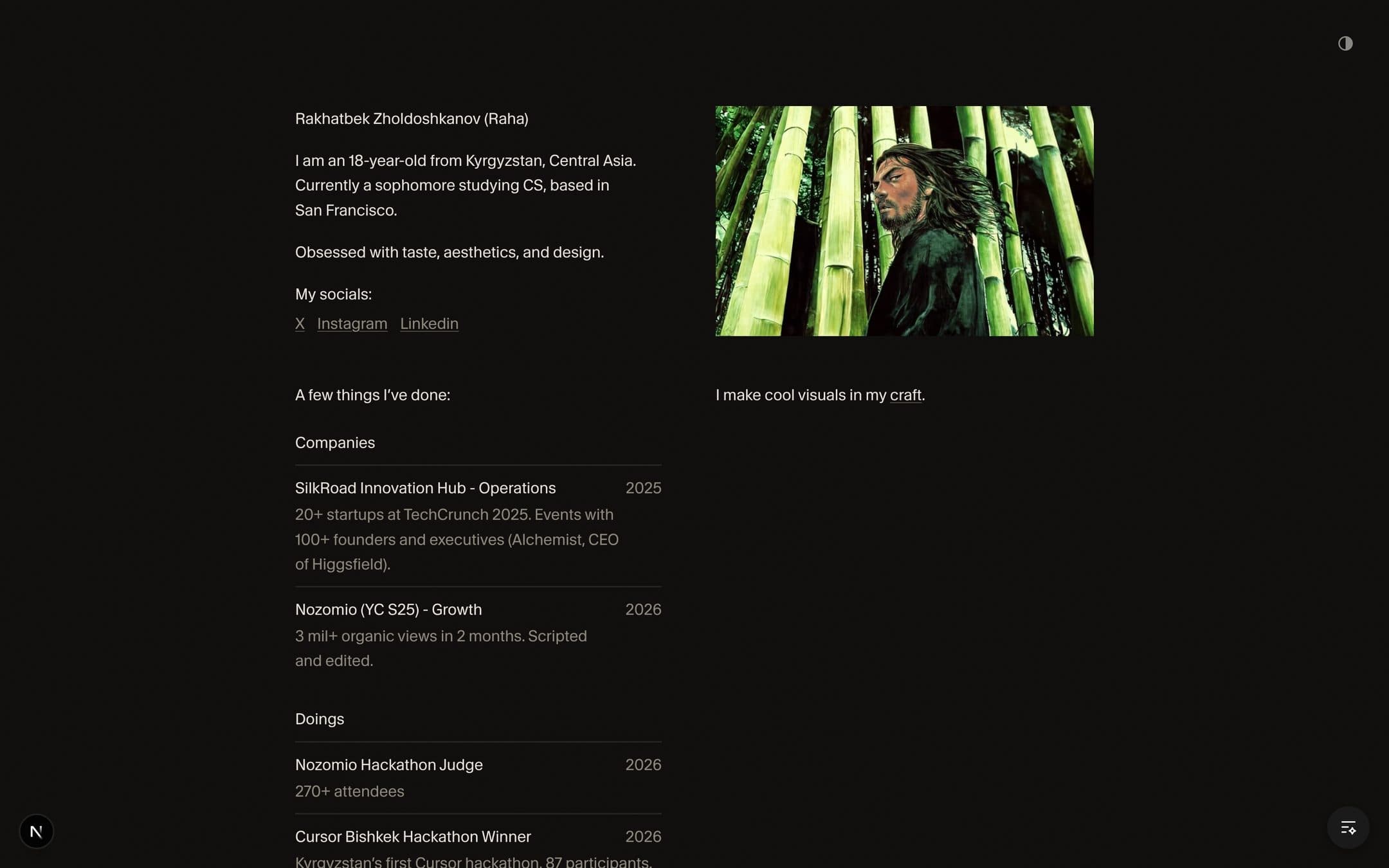
It started dark, with two columns and a picture.
The first version went up in one day: a bio, a list of companies and doings with a line of proof under each, a manga portrait, and a link to a craft page.
- Personal site: intro, experience list, and craft page
20 to 24 August
Then the craft took over.
For a week the home page barely changed. The work went into the craft pieces and into rules for them: a template, one spacing scale, and no fake depth.
- Add a craft piece template and scaffold script
- Make spacing a preset: one scale, everything derives
- Drop 3D depth site-wide; copy keys ride the frames; page moves up
12 to 25 September
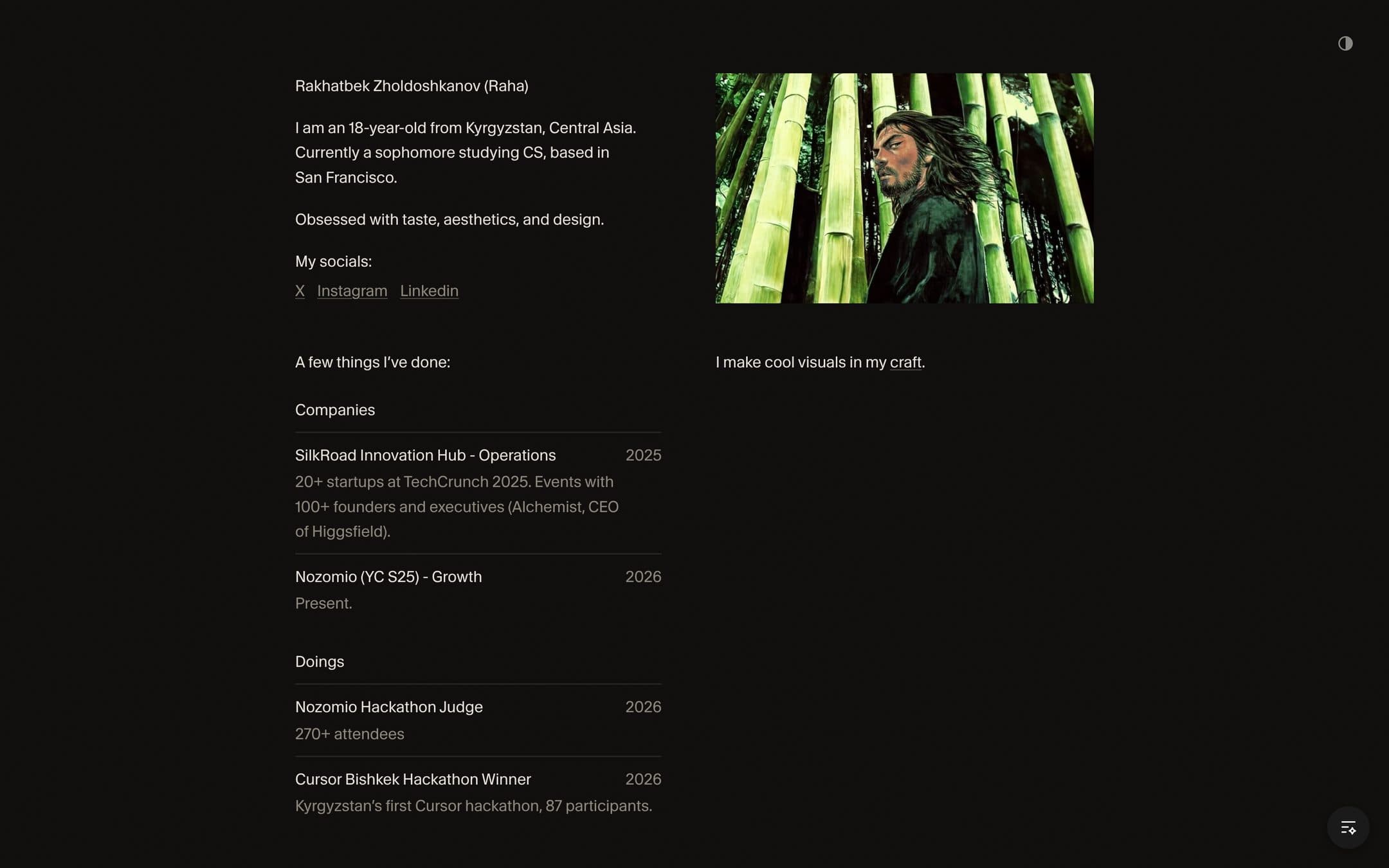
I started cutting.
Seven craft pieces were taken down. The proof lines under the companies went too. The page said less and I liked it more.
- Strip four craft pieces and add Sweep, a navy hover-fill list.
- Strip Liquid Glass from craft
- Strip Trusted By from craft
25 September
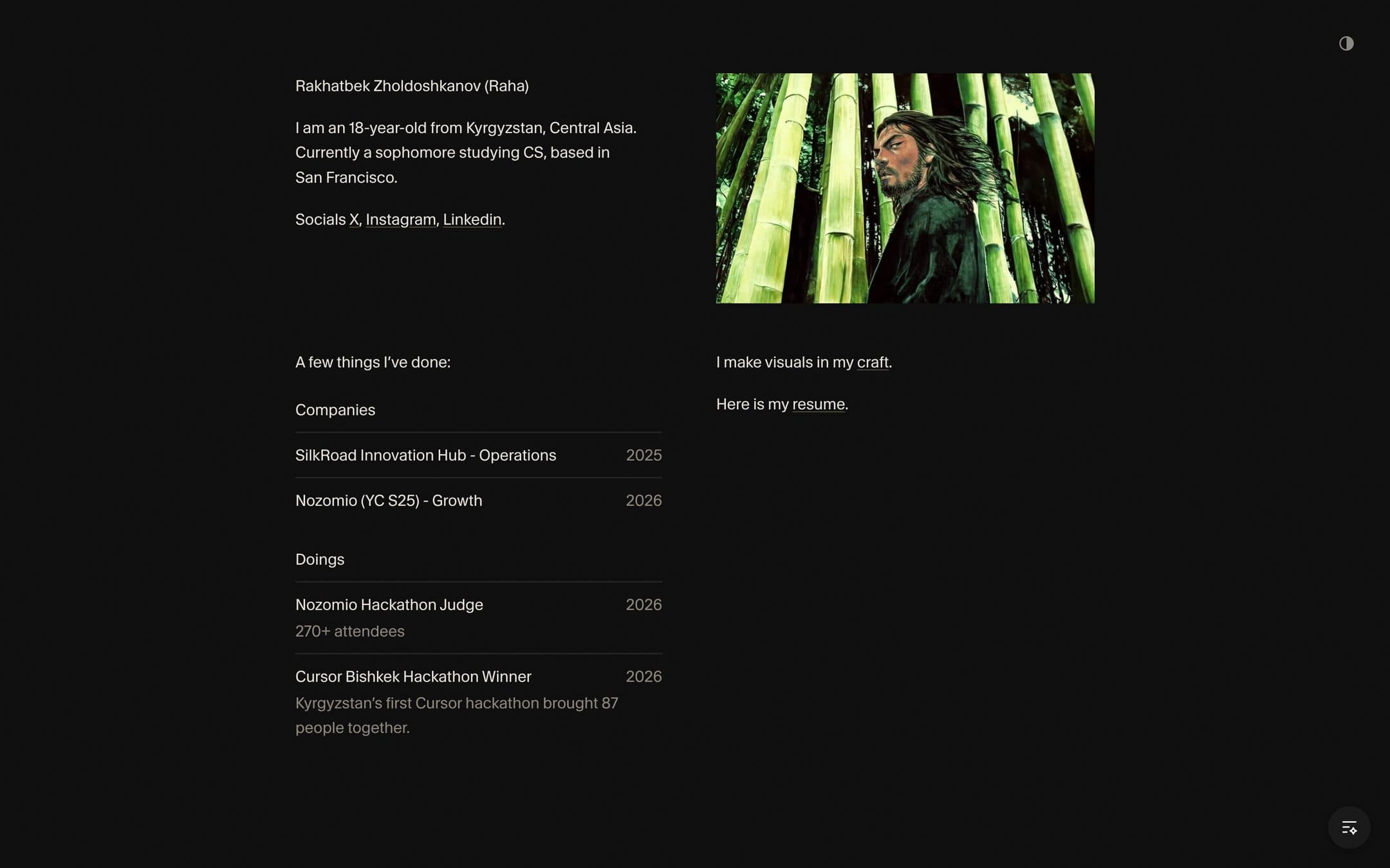
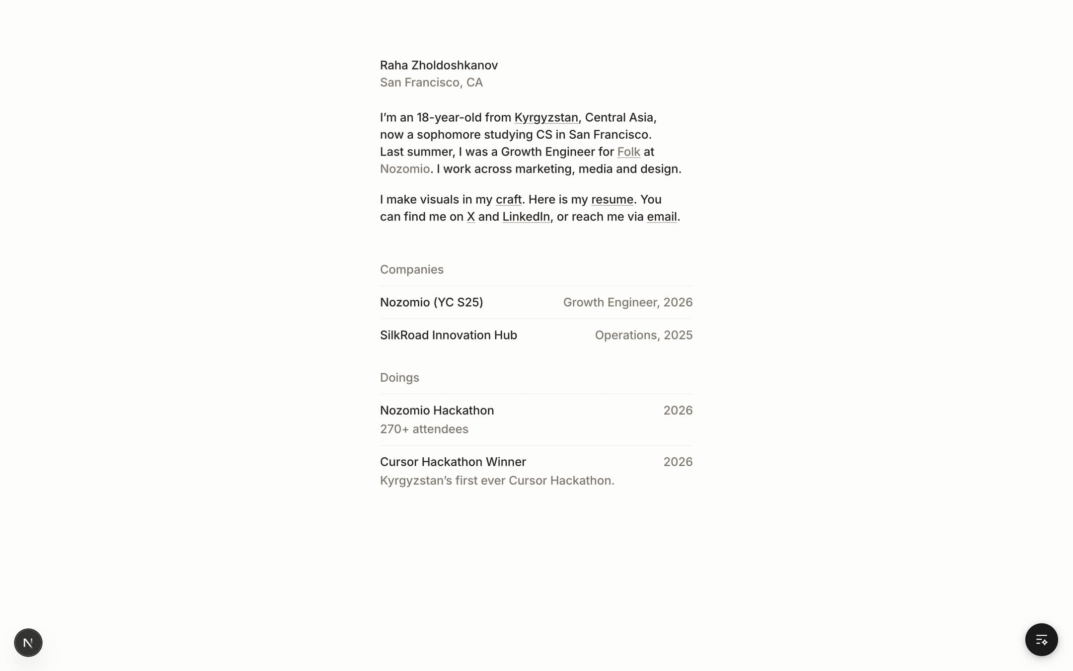
One column, light, no picture.
I drew it in Figma first and then built it: one narrow column, Inter, a paper background. The portrait and the dark theme both went.
- Inter at 460, light theme only, Growth Engineer role
- Single-column homepage from the Figma file
7 October
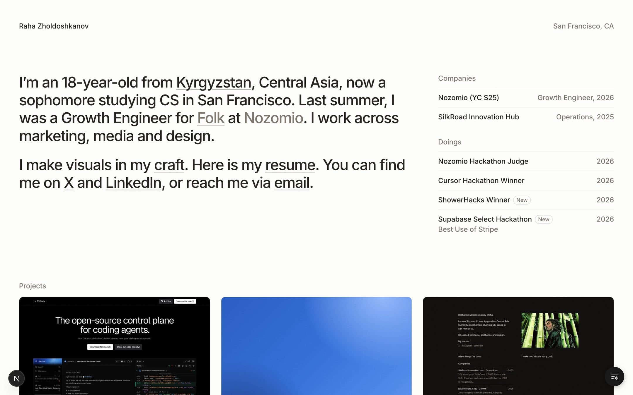
Then the bio got big.
The page went wide: a large bio on the left, the lists beside it, and the projects underneath.
- The home page goes wide: a large bio, the lists beside it, projects below
9 to 21 October
Three columns, and a full row of projects.
The bio came back down to the size of the lists, in three columns with no lines. The hackathon designs, OpenEvidence and OpenRouter joined T3 Code, four across.
- The home page goes to three columns with no lines, and the resume is set three ways
- Hackathon designs replaces the blue card: Fairseat, Creator Ops and Blast, running
- OpenEvidence and OpenRouter join the projects, each with its case study
Why I moved
I wanted to emphasize my thing in the actual text, and actually show the reader who I am.
The single column was clean, and it could have been anyone’s. That is the reason I moved on from the basic one.
The ugly research
Most of what I made to get here was thrown away.
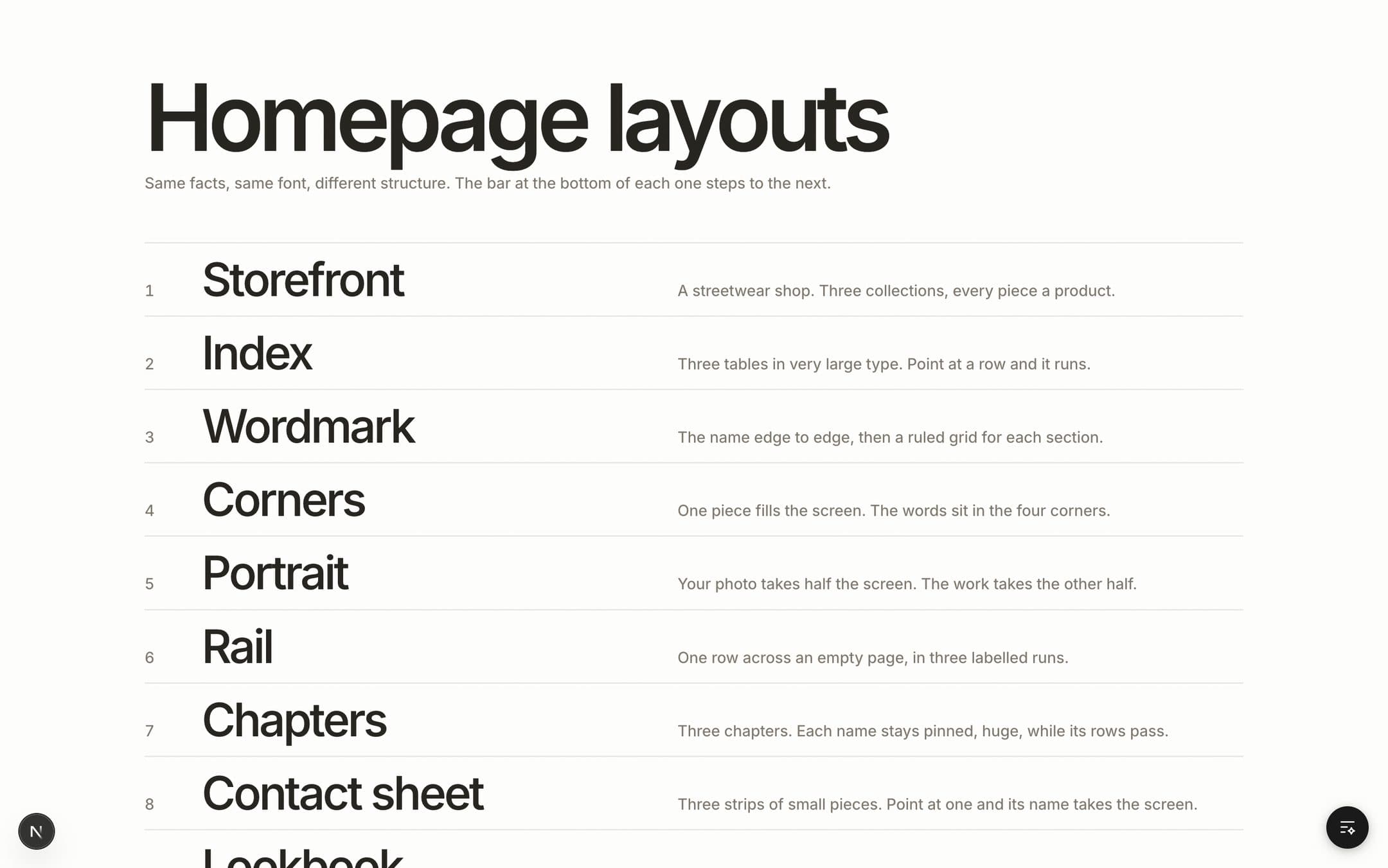
On 5 October I built ten different home pages in one sitting, then twelve more. I kept two.
- Add the lab: ten homepage layouts and an empty case study
- Lab: twelve quiet layouts in Inter, with craft, work and hackathons apart
Then I stopped guessing and measured. I opened thirteen personal sites and recorded where every block of text and every picture sits, with the words and images taken out.
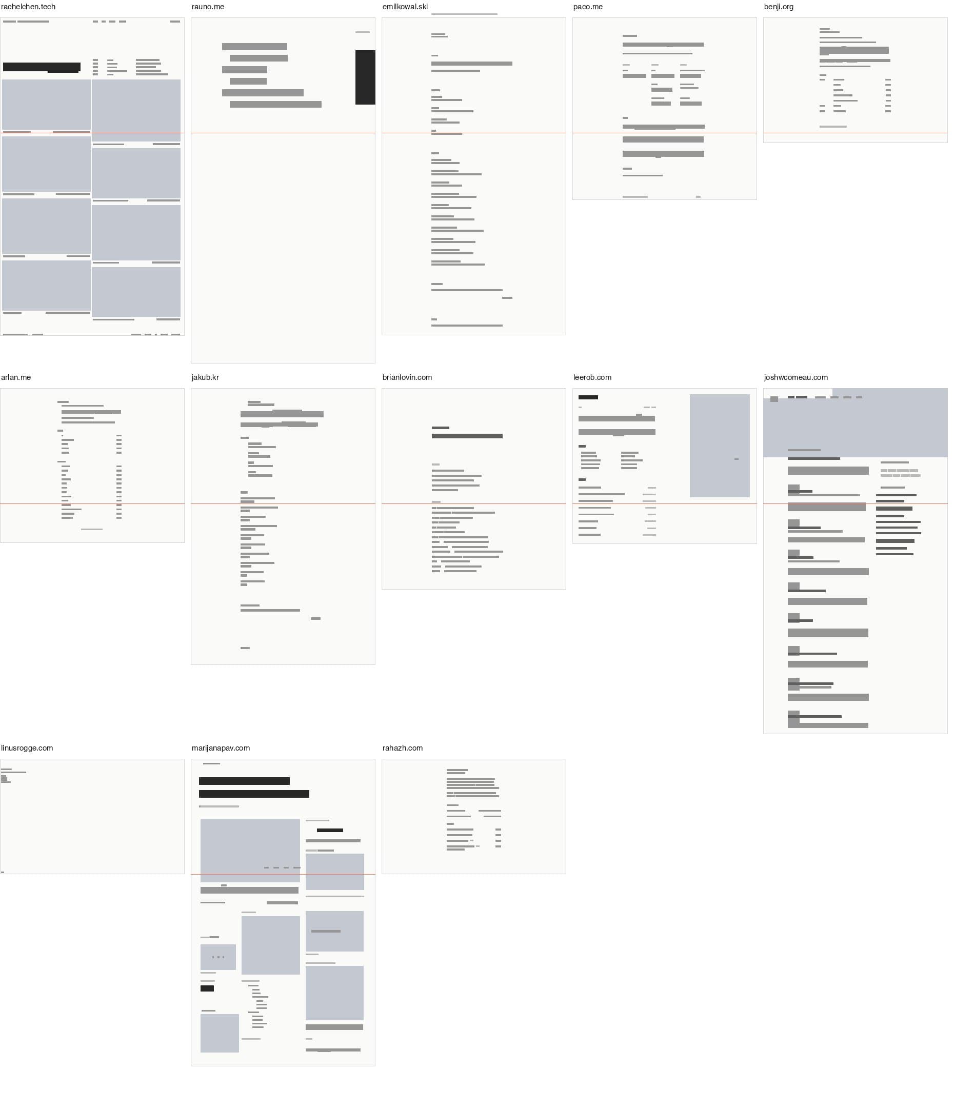
Engineers
1 size
One text size for everything, and no pictures. My site was one of these.
Designers
4 to 8 times
The largest text is four to eight times the body size, and the work is shown.
Where it is now
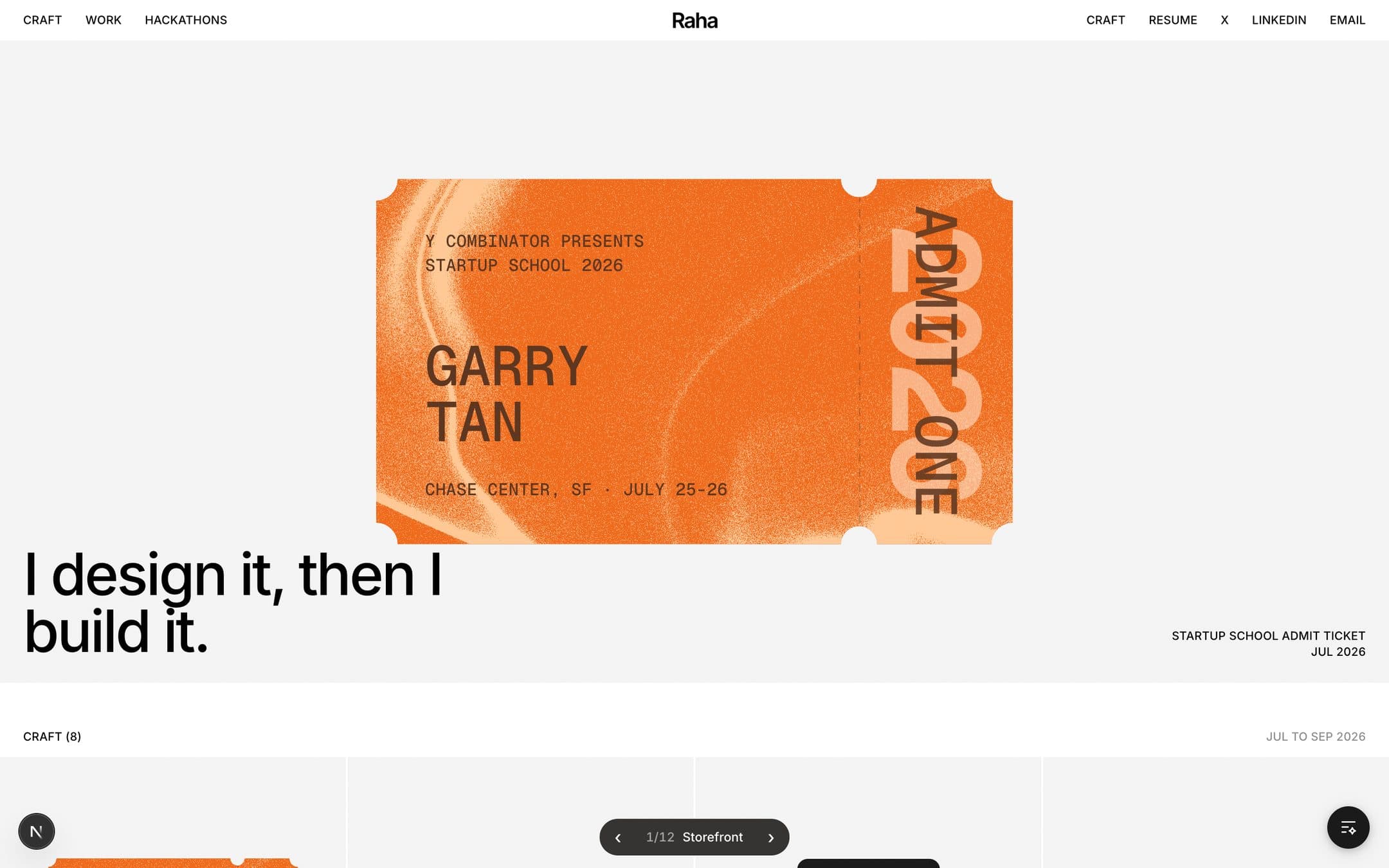
People need to really know about me. That is why my About Me came first.
For the latest version, the thinking was that people need to really know about me, and I really want to emphasize the character part. Essentially, I am explaining myself.
Kyrgyzstan is an interesting country, and visiting it is getting popular. I did not want to just navigate you to Wikipedia. It is boring. That is why I use a preview to show it and go to one of my favorite Kyrgyzstan reels.
The doings are there for the same reason. People should show something they do outside of work. I do not really like it when people only post about their work. The personal part of a site should be about something that has nothing to do with the job.
What I want next
It is not finished, and I want to do more.
- Write up the hackathons.Cursor and ShowerHacks are still only a line each.
- Make it mine on a phone.The large layout was drawn for a wide screen first.
- Keep the lab.Throwing away twenty layouts is how I found this one.